
 Jun 21, 2019
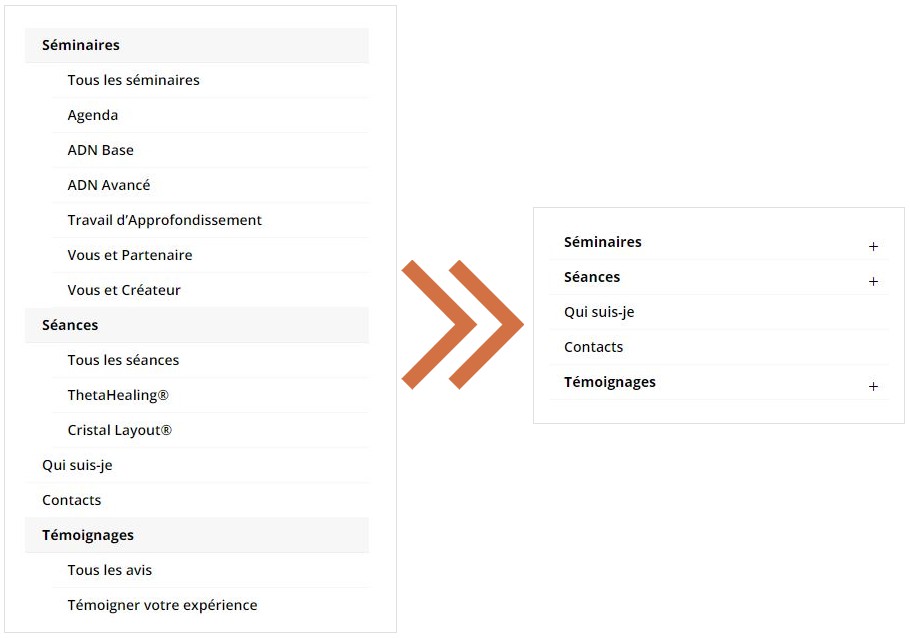
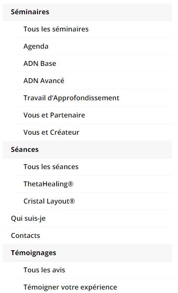
If you have a Divi-powered WordPress website with a large menu, contained nested menu items, you can face with the following issue for the mobile and tablet views: the nested menu expands, holds the whole screen and some menu elements can be hidden.
There is a hack to make the Divi mobile menu look more compact and collapse the nested items.

- Copy-past the following css-code to your style.css or to the place where you hold your style sheets (you can also put the code here instead: Divi Theme Options -> Integrations -> Add code to the body)
- Copy-past the following php-code to the functions.php (you can also put the code here instead after the inserted css-code: Divi Theme Options -> Integrations -> Add code to the body)
#main-header .et_mobile_menu .menu-item-has-children > a {
	background-color: transparent;
	position: relative;
}
#main-header .et_mobile_menu .menu-item-has-children > a:after {
	font-family: 'ETmodules';
	text-align: center;
	speak: none;
	font-weight: normal;
	font-variant: normal;
	text-transform: none;
	-webkit-font-smoothing: antialiased;
	position: absolute;
}
#main-header .et_mobile_menu .menu-item-has-children > a:after {
	font-size: 16px;
	content: '\4c';
	top: 13px;
	right: 10px;
}
#main-header .et_mobile_menu .menu-item-has-children.visible > a:after {
	content: '\4d';
}
#main-header .et_mobile_menu ul.sub-menu {
	display: none !important;
	visibility: hidden !important;
	transition: all 1.5s ease-in-out;
}
#main-header .et_mobile_menu .visible > ul.sub-menu {
	display: block !important;
	visibility: visible !important;
}
	function mobile_menu_colapse_nested_levels(){
	?>
		<script type="text/javascript">
		(function($) {
			function setup_collapsible_submenus() {
				var $menu = $('#mobile_menu'),
					top_level_link = '#mobile_menu .menu-item-has-children > a';

				$menu.find('a').each(function() {
					$(this).off('click');

					if ( $(this).is(top_level_link) ) {
						$(this).attr('href', '#');
					}

					if ( ! $(this).siblings('.sub-menu').length ) {
						$(this).on('click', function(event) {
							$(this).parents('.mobile_nav').trigger('click');
						});
					} else {
						$(this).on('click', function(event) {
							event.preventDefault();
							$(this).parent().toggleClass('visible');
						});
					}
				});
			}

			$(window).load(function() {
				setTimeout(function() {
					setup_collapsible_submenus();
				}, 700);
			});
		})(jQuery);
		</script>
	<?php
	}
	add_action('after_body', 'mobile_menu_colapse_nested_levels');
FYI: here is the official video from the Elegant Themes (Divi developer) about mobile collapsing nested menus.
That’s all! Enjoy!